01 / Problem
Create variety without losing consistency.
Game interfaces often need panels, bars, buttons, and containers that serve different content while still feeling like parts of the same world.
Components / Visual language / Extensibility
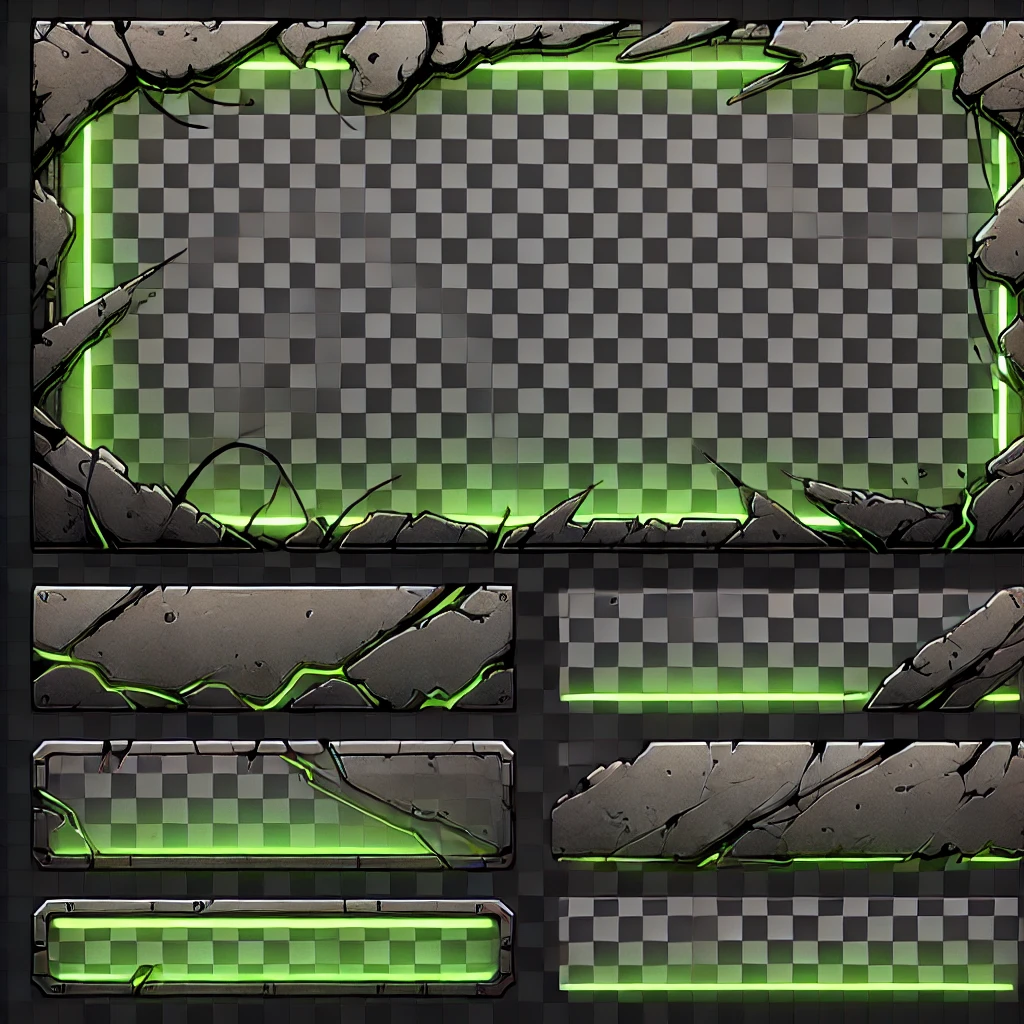
A visual-language study exploring how a cracked-stone frame and green energy treatment could support related panels, bars, buttons, and status elements.
The design at a glance
Cracked stone, dark surfaces, green light, and consistent edge treatment create a recognizable family across a large frame and smaller horizontal pieces.
The checkerboard is visible in the supplied image. This study is presented as a styling exploration, not a production-ready transparent component library.
01 / Problem
Game interfaces often need panels, bars, buttons, and containers that serve different content while still feeling like parts of the same world.
02 / Design intent
The stone silhouette provides structure and weight; the green glow communicates energy, emphasis, or a possible active state.
03 / Key decisions
04 / Interaction & usability
A production system should define when glow means active, selected, charged, or simply decorative, then maintain readable content and focus indication over every component.
05 / Tools & skills
Component styling, game UI art direction, shape language, hierarchy, consistency, visual states, and thinking about reusable interface families.
06 / What I’d improve next
The next step is to document tokens, spacing, state meaning, content limits, and implementation behavior so the visual language can support a larger product consistently.
Next level / Let’s work together