01 / Problem
Present several offers without making the store feel chaotic.
Players need to compare reward amounts and prices quickly while still recognizing special value and understanding how to leave.
Storefront / Monetization / Choice
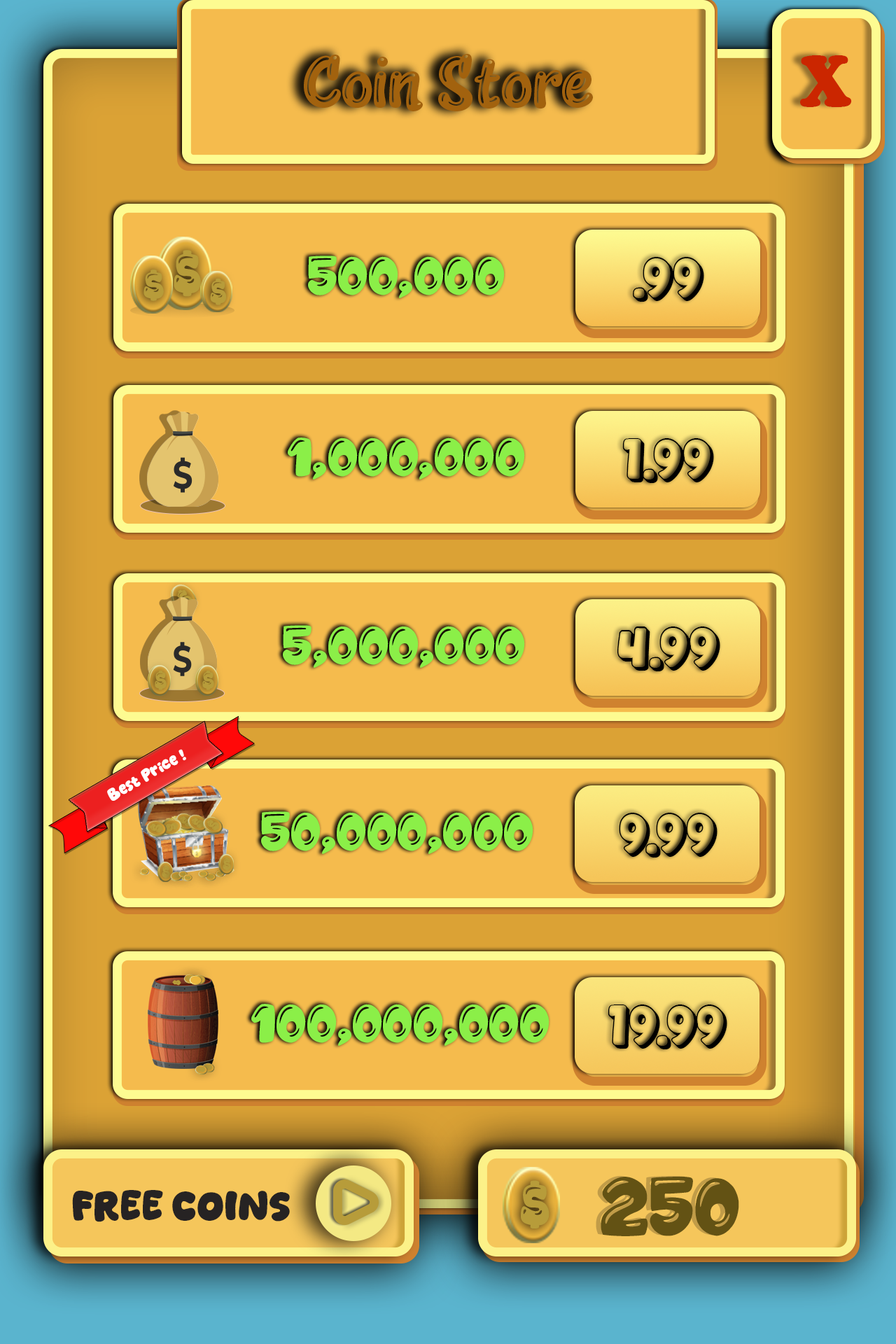
A mobile storefront study that organizes purchase tiers, emphasizes value, and keeps the player’s current balance visible.
The design at a glance
Repeated rows establish a consistent reading pattern: reward image, coin amount, and price. A ribbon calls out a featured offer, while the balance and free-coin action remain visible.
This study demonstrates interface composition. It does not claim conversion results, shipped transactions, or user research.
01 / Problem
Players need to compare reward amounts and prices quickly while still recognizing special value and understanding how to leave.
02 / Design intent
Each tier uses the same structure so the eye can compare vertically, with larger coin bundles represented by increasingly substantial containers.
03 / Key decisions
04 / Interaction & usability
A production flow should identify currency, explain any rewarded-video action, confirm purchases, and support cancellation, success, error, and insufficient-funds states.
05 / Tools & skills
Storefront composition, component consistency, visual hierarchy, pricing presentation, callout styling, touch targets, and game-economy interface thinking.
06 / What I’d improve next
I would turn the repeated offer row into a reusable component with inventory, localization, pricing, accessibility, and transaction states defined before implementation.
Next level / Let’s work together